Mobile-First, Responsive UX & Web Design
—
Mobile-First, Responsive UX & Web Design —
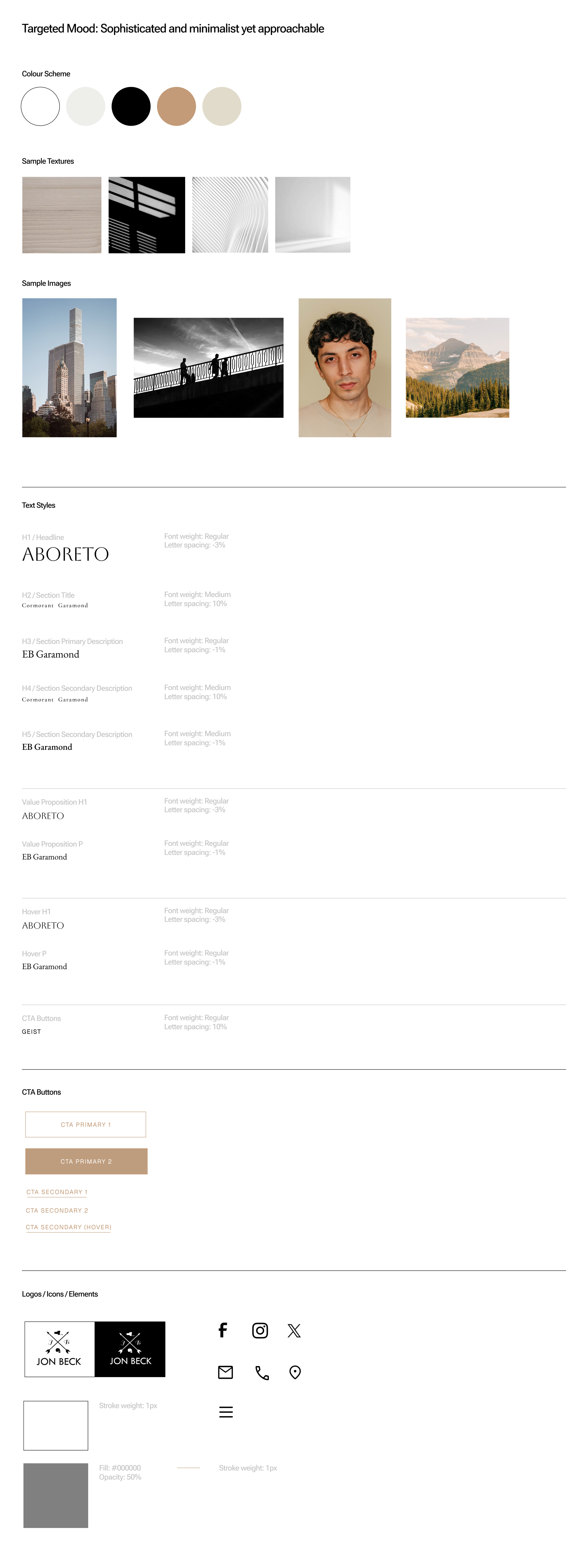
MOODBOARD
MOBILE
DESKTOP
DESIGNER NOTES
-
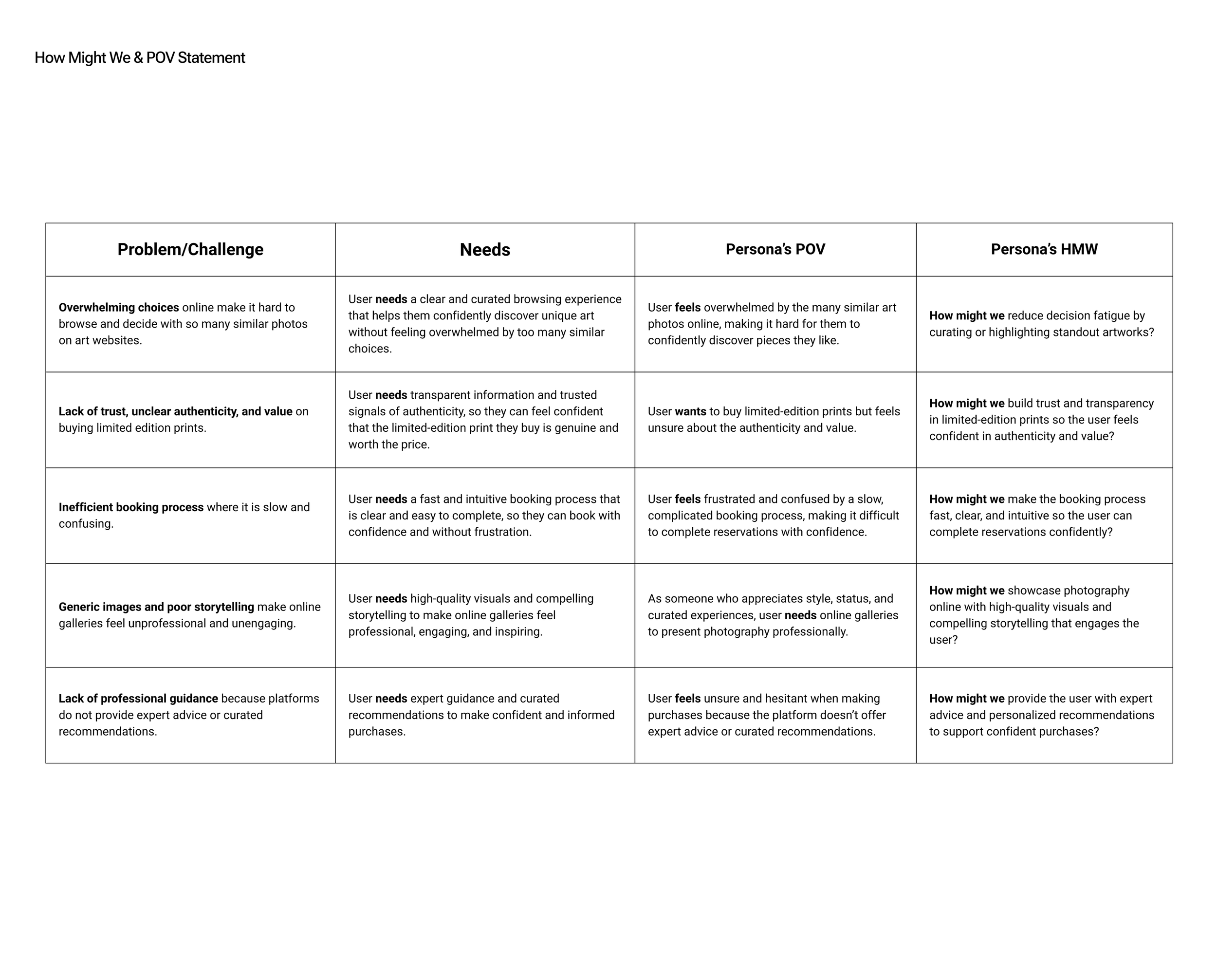
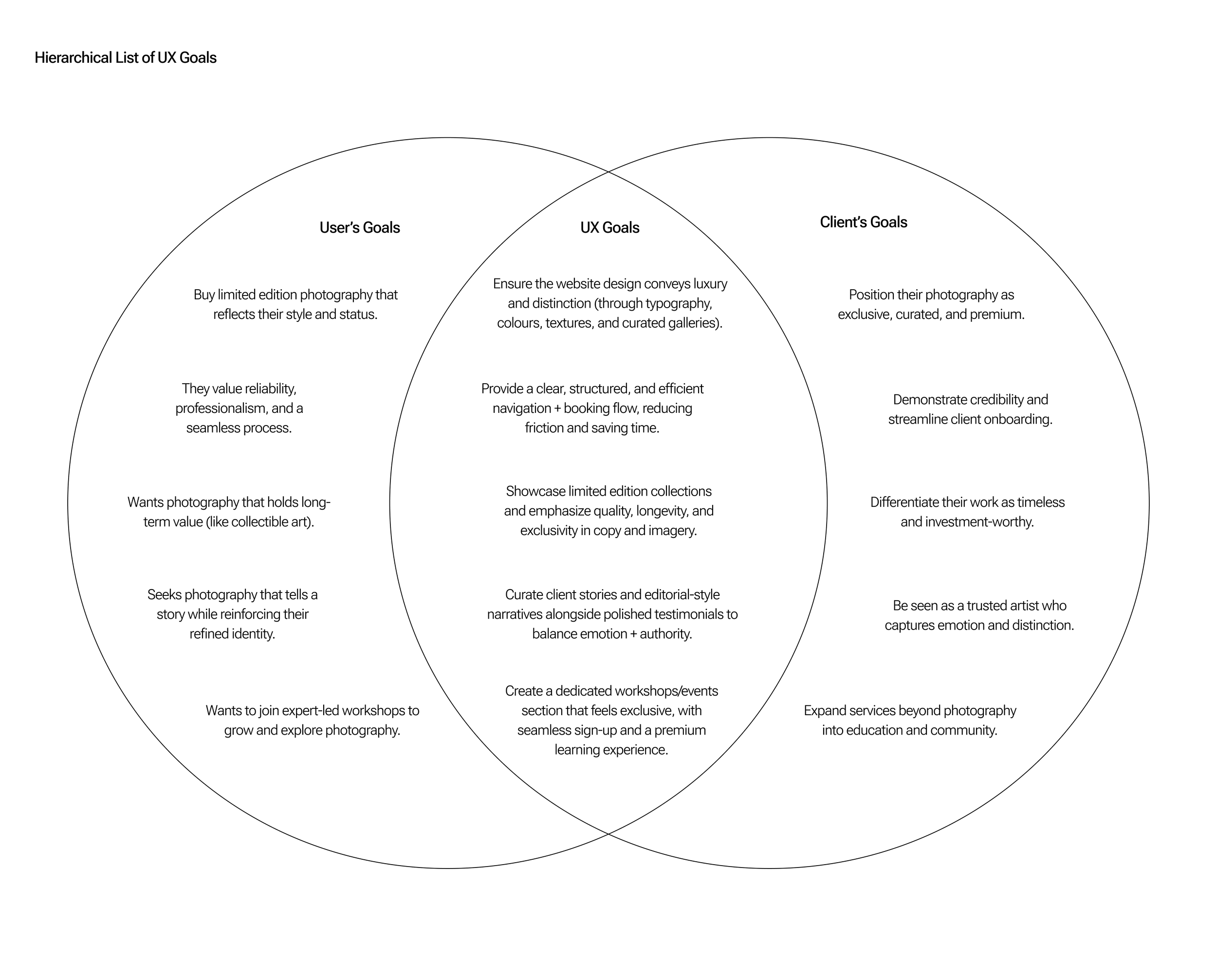
The website showcases the client’s photography while communicating their unique value: a photographer who combines artistry with tangible benefits for clients. It positions the client as both creative and solution-driven, blending emotional storytelling with clear value communication.
With over 60% of viewers accessing via mobile, a mobile-first, responsive design ensures an optimal experience across all devices.
-
Rule of Thirds & Z-Pattern: Aligns images and header to natural eye movement for better engagement.
Alternating Layouts & Breaking Frames: Symmetry and asymmetry, overlapping images and text maintain interest and flow.
Continuity: Visual elements guide the eye down the page for seamless interaction.
-
Content Flow: Header, Hero, Featured Sections, Value Proposition, Footer supports conversion.
Focal Points: Color, contrast, and motion direct attention to key elements.
Grouping & Scale: Related content grouped; element sizes indicate importance.
-
Fonts: Aboreto (H1), EB Garamond (Paragraph), Geist (CTA) – elegant, readable, action-focused.
Color & CTAs: Consistent palette reinforces identity; CTA buttons are distinct and strategically placed.
-
White Space: Prevents clutter, improves focus.
Mobile-First: Responsive, touch-friendly layouts with Z/F-pattern scanning.
-
Dynamic Content: Filters update galleries, keeping UX fluid.
Hover Feedback: Color/animation indicates interactivity.
Gestalt Principles: Figure-ground, closure, continuity guide user attention.


